
|
This was feedback posted for .Extract.
checkin polls.. good luck extract..................
|
Voted For: .Extract.
v- Extract I can actually read his text. Both need to work on backrounds though. |
This was feedback posted for S.P
Thats tight yo........................................
|
uppin i cut kindda bad but me somes votes plz
thanx |
Voted For: S.P
i was feelin this one more, more creative.....and good use of the color..... |
^wat....are you metal?...
uppin........................ |
Quote:
you fo da vote will return da favor soon |
This was feedback posted for .Extract.
postin feedback for my boy Extract pretty nice but it would of been better if it was someone from the steelers :-p
and SP it looks like Kobe doesnt have any legs...straight nubbin it? |
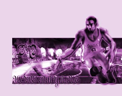 first off...this is wat is wrong.. the B/G is fucked..the hangover sucks..the hangover is supposed to match the RV background..which in the sig its pink!.....anywho..yea..the pic of kobe looks like it came from a game...the text sucks.....kobe has too much of a glow to him to see thow bad the cut actually is..and he has a line around him..he has no legs..there is supposed to be a basketball...he is dribbling...and the color is bad enough...Period! |
Voted For: .Extract.
v/Extract for having better bg etc.....period. |
Voted For: .Extract.
Extract- Yours is ok, the text could be better, the set up is cool, quality is good, could have blended better, the brushing is ok SP: Pic = HORRIBLE, the pic quality is bad and badly cut, the text is so random..I kinda like what you did to the background on the left..go read some tuts V/Ex |
Quote:
well ma computa color messed up that why sum of ma sig be messy |
| All times are GMT -4. The time now is 04:46 AM. |