
|
S.P vs .Extract.
Battle Rules:
regular sze theme sports Minimum posts to vote: 300 Check in by: 08-27-05 at 02:34 PM Must drop verse in 5760 minutes after check in. |
can it be a hangover..............................
|
Make it watever you want..just comebetter then you have been coming....
|
.Extract. has ACCEPTED this battle on 08-23-05 05:47 PM.
|
 |
okkkk.........
i will try to come better......... |
S.P has ACCEPTED this battle on 08-24-05 08:02 AM.
|
aight but ma computa is fucked i will have it 2nite or Thursday
|
damn man..drop ya sig..................................
|
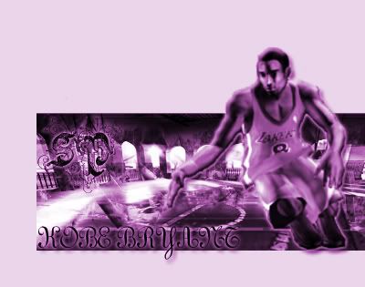 here is sumthing |
start voting...................
rite now plz...... |
Voted For: .Extract.
I'ma have to go wit Extract here. did a real dope job of cuttin' the pictures. Real nice. Background tight too. and the font is straigh till yo. Jus don't like how you inserted font it. But other than that shit was nice. SP's was aiight. Wsn't really feelin' how you blurred kobe. and the font I ain't like at all. but shit was decent. but overall, i think extract took this. both keep elevatin' tho. word pc |
This was feedback posted for .Extract.
u got this no doubt..... props i didnt even know u could do anything besides sports but u did so im proud
|
yup thank you will apeer for the complements..and uppin for more Votes.........
|
This was feedback posted for .Extract.
i dont know how to vote on this really...
both were quite original, but not that great i unno ima call it a tie, lol |
This was feedback posted for .Extract.
checkin polls.. good luck extract..................
|
Voted For: .Extract.
v- Extract I can actually read his text. Both need to work on backrounds though. |
This was feedback posted for S.P
Thats tight yo........................................
|
uppin i cut kindda bad but me somes votes plz
thanx |
Voted For: S.P
i was feelin this one more, more creative.....and good use of the color..... |
^wat....are you metal?...
uppin........................ |
Quote:
you fo da vote will return da favor soon |
This was feedback posted for .Extract.
postin feedback for my boy Extract pretty nice but it would of been better if it was someone from the steelers :-p
and SP it looks like Kobe doesnt have any legs...straight nubbin it? |
first off...this is wat is wrong.. the B/G is fucked..the hangover sucks..the hangover is supposed to match the RV background..which in the sig its pink!.....anywho..yea..the pic of kobe looks like it came from a game...the text sucks.....kobe has too much of a glow to him to see thow bad the cut actually is..and he has a line around him..he has no legs..there is supposed to be a basketball...he is dribbling...and the color is bad enough...Period! |
Voted For: .Extract.
v/Extract for having better bg etc.....period. |
Voted For: .Extract.
Extract- Yours is ok, the text could be better, the set up is cool, quality is good, could have blended better, the brushing is ok SP: Pic = HORRIBLE, the pic quality is bad and badly cut, the text is so random..I kinda like what you did to the background on the left..go read some tuts V/Ex |
Quote:
well ma computa color messed up that why sum of ma sig be messy |
| All times are GMT -4. The time now is 04:34 AM. |