
|
.::Tricky::. vs Young Un...
Yup
Make An Anime Sig Werd:cool: Minimum posts to vote: 20 Check in by: 02-22-06 at 03:01 PM Must drop verse in 4320 minutes after check in. |
.::Tricky::. has ACCEPTED this battle on 02-19-06 03:03 PM.
|
Young Un... has ACCEPTED this battle on 02-19-06 03:24 PM.
|
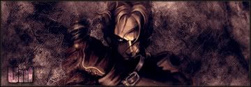
 [IMG]http://img1.imagetitan.com/img1/1/14/trickybattlesig.png[/*IMG] |
 Werd,Lol I Hate My Mic -_- |
Voted For: Young Un...
Tricky, i don't like that leave brushed effect you have, too unlike rap or anything cool. but you do have color. i love unf's dark look and his gruenge type of sig.....his text is hard to read, but as an overall look, he took this |
iight........gooooood luck G......................
|
and by the way....i'm just battlin Fuh q for fun coz i just wanna get feed on what areas i need to improve on
|
Voted For: Young Un...
FOR NOT RECYCLING THE BACKGROUND . |
wtf.....i never used the same background..........
|
Voted For: .::Tricky::.
Tricky won cus his design felt mo complex, q looked like he just took that nigga from fable, made a background n shit, put him on the spot with some text, all to basic. |
Voted For: Young Un...
"Fuh.Q" vote this is some good stuff all blends well but your text is abit unclear .::Tricky::. good but you seem to always do the same background gets old also not feelin it |
Voted For: .::Tricky::.
Ma vote go to dis guy nice B/G but the only thing dat throws it off is da black areas |
daubs bote needs to get removed...................
|
Why???
Buddys Does Then His Aint Explained Really |
Voted For: Young Un...
I like this one shit look pretty graphic. It lends very well with the picture although i see alot of people use the same background . |
Voted For: .::Tricky::.
Vote Tricky For overall having a doper sig.. nice bg ...good pic pretty decen text..as for unf ive seen that pic used so many times..and your sigs just way to empty. |
Voted For: .::Tricky::.
Tricky...im feelinit likin colors n all dat unf shit is too basicc................................... |
Voted For: Young Un...
i like the grunge feel to it. bvlending is nice, text is not very good, but too blended. V/ Fuh and for tricky, u need to get better brushes. it is what you are missing, and you need to get new fonts. |
| All times are GMT -4. The time now is 09:10 PM. |