|
Daubs vs Snipes
Battle Rules:
topic: 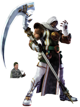 size: 360 x 150 No recycling No Biting No Crew Votes No D/R Minimum posts to vote: 20 Check in by: 11-26-05 at 02:46 PM Must drop verse in 1440 minutes after check in. |
Daubs has ACCEPTED this battle on 11-26-05 12:11 PM.
|
15 mins like i said:
 . |
Snipes has ACCEPTED this battle on 11-26-05 12:14 PM.
|
|
Voted For: Daubs
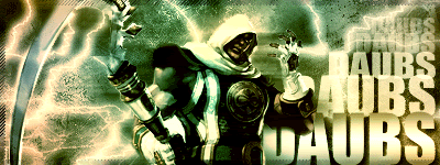
V/Daubs... Daubs- decent sig, nice lightning, text was ok...colors were cool.. SP- color was discusting, border wasnt good and overall a pretty messy sig, your sigs look repetitive IMO |
Voted For: Daubs
1 sided IMO. daubs had better text, bg, coloring .. snipes - work on your text and coloring. there was a lot of open space in your sig and the bg was ok.. v/ daubs. |
Voted For: Daubs
good battle snipes- bad text, bg is ok... better than a lot of ur sigs tho daubs- not much of a border, text is good, bg is good... pic looks a bit choppier than in snipes, but still good v/daubs |
Voted For: Daubs
I like the overall look and feel of Daubs...Colors are great and the font is good. Snipes is boring in comparison and the font is terrible. Back ground is ok but is nothing compared to Daubs back ground |
| All times are GMT -4. The time now is 01:24 AM. |