
|
The Game- Son Of A Gun
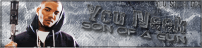 kinda fucked up on the border, should of made it solid fonts are straight in my mind but, You Shook Graphics!,What What! |
Another One Of Str8 Hood Sigs ..
10/10 |
lol, yeah thanks
upping |
better than what ive seen from you so far....
textwork was pretty nice...although i dont like the lil wave on the subtext... seen that pic, as well as jus too many game sigs though... anyways 6.5/10 |
Quote:
well... hes new.. so he wouldnt know who had that pic on here.... |
word, good looks lol
but i would rock more game sigs i dont give a fuck |
The gun kind of overlaps the border, font is ok, backround is nice, overall a lot of simple elements put into one sig. Still pretty good though.
|
yeah i should of made it nice and solid but o well
|
Nice Fam.
The Only thing I dont like about my sigs, is the text. and every other Gfx head on this site does nice text, I always find a way to fuck mine up. lol, props on the sig tho, I iked it, Bit too wide for the hieght, but dope. |
its pretty good, i know you didnt cut tha pic but the bg is tight, text is good overall its good, i just htink the size is kinds weird but its just me
|
| All times are GMT -4. The time now is 04:57 AM. |