
|
Em Cover..
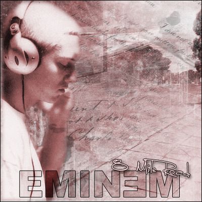 |
10/10... color choice, text, pic all good
|
yea its really nice...
but the CD title font isnt really eminem esque... too much open space on the right...therefore cant really see it on a shelf... but other than that i really like it... pretty good work.. 7.5/10 |
looks alot like hoodz cover......cept the font isnt as good
|
its dope, already said in ls forum, only bad thing is it looks like the pen is stabbin him in the head.
|
Quote:
which one........... :huh: |
shieet...it does.... dammit.. anyways sorry hoodz... i didnt know
|
Looks good, nice color same as your ja sig , think it could have been darker ....font's okay, think it could have been better..overall nice cover looks alot like hoodz ...keep it up 8/10
|
Quote:
itz koo man....i like this tho....nice color scheme like daubs said pen look like itz stabbin him utha then that itz pretty nice text iz a little borin....an tha title iz ehh...but i like it a lot :thumbup: nice job |
I think it would have looked better with the street showing more. This is nice, but the open space in the top right brings it down. The font isn't something I can see on a Eminem CD, but overall is this pretty good.
|
i like the colors on this, but like they said, to much open space~
text is ehhh~ pen staabbin him~ reminds me to much of hoodz~ but nice overall~ 7.5/10~ |
u transform to horizontol.....................
|
| All times are GMT -4. The time now is 05:25 AM. |