
|
New Crew sig.......
Theme - Splinter Cell....
I actually like it, nice little sig wit animation................ 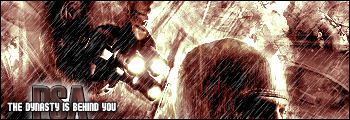 please leave feedback................ |
rain is rando here, otherwise good.
|
Ye same its well dope............really smart dawg!!!!!!
|
thanks yo, thought it would go will with the pick,.............uppin.................
|
Damn thats tight, the text seems alittle cut off alittle bt, but other wise dope.
|
yr text is cut off.................
|
Its not cut off, its directly on the boarder at the bottom..............
|
I don't like the text, doesn't blend that well. Good other than that.
|
I dont like the text positioning, Rain is pretty dope, but Splinter Cell is played waaay out in my eyes.
|
DAmn man that animation is real nice. I think the text needs to be re-positioned cus you cant really read the text underneath.
|
ight..............uppin..........................
|
wow, overall - the sig i think is str8, but some things i think you can do to improve is
move the PSA up AT LEAST one pixel higher, just to make it look better. to be honest i think this text would look good completly centered, and bigger - but that sjut my opinion other than that good shit man, i like it |
| All times are GMT -4. The time now is 02:40 AM. |