
|
TE sig..
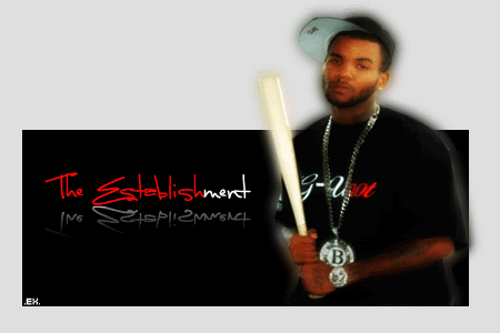 just messin with shit on PS.... |
i like the text on that
i was supposed to make an establishment logo, so i might incorporate some of that into my logo...... i dont like that game pic at all though...looks bad quality. |
what tizzle said, the game pic is the downside
|
Bad font for a reflection.
|
yea i agree, with you tiz...the game pic was very bad quality..i tried to make it look good, plus it was leaning to the side, when i cut it.... and yea i should have used a different font to reflect..at first i didnt think i did it right..:/..thanks for the feed tho..
|
If you had a bg, it could be dope.
|
:/..................
|
Its just black yo, dont give me that :-/ shit..... lol
|
:/
that is the look...lmao |
^^alba's seriously just asking for it in that pic
|
wordness....i was thinking about cutting her out and making asig..but no so sure yet..:/
|
werd, make a TE alba sig........
|
not bad but ye like they saig the game pic is on the downside.......but idc if its black..its original...and the reflection isnt the best...but its not too bad
|
thanks for the feed..
and K.S. its on its way...:thumbup: |
its str8..............................
|
| All times are GMT -4. The time now is 03:43 PM. |