
|
Snipes vs -KSR-
Battle Rules:
6 - UNLIMITED Lines No Crew Votes No Recycling No Biting Topic- Cartoon or VideoGames size- 360-150 Minimum posts to vote: 20 Check in by: 10-16-05 at 02:37 AM Must drop verse in 1440 minutes after check in. |
-KSR- has ACCEPTED this battle on 10-15-05 02:53 PM.
|
|
Snipes has ACCEPTED this battle on 10-15-05 10:53 PM.
|
 |
thanx fo da luck man
and same to u u did Luigi i did Megaman NT |
Voted For: -KSR-
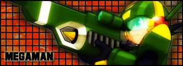
snipes-pretty dope sig...megamans a classic problem is its too plain you had good effects on your guys glasses..but thats about it...colors blended good..but the choices for them werent that dope -ksr- - your sig was cool you had awesome effects on your sig all around...good blending with the colors...looked good...i like the text and sway....better overall v/-ksr- rtf in a couple days...look in sig in a couple days |
Voted For: -KSR-
This is some tight shit. The background matched wording and pic, like how the background blends in a lil. 7.5/10 Snipes yours was aiight, was kinda boring to me. But it was still good. 6/10 |
This was feedback posted for -KSR-
Checcin Polls..........................
|
uppin............................................. .......
|
Voted For: -KSR-
Meh @ me resorting to desperation to get some friggin votes on RV...so...i reckon KSR got this because his sig has more variation of colour and context while Snipes sig is jus basic colour no real shading whatsoever plus i like Mario Bros better than friggin Megaman lol...KSR font choice for his sig was better too more of an original style of graffiti writing where as snipes' style was plain... A MERKING IN MY EYES...RTF in my sig (vs E.C) |
Voted For: -KSR-
background im giving to ksr liking that effect snipes not really feeling the grid text i dont like either but ksr's looks better wth his sig picture id say tie it snipes you have too much glare in places and ksr not feeling the mark accrost his stomach |
Voted For: -KSR-
although i dont like either sig too much ksr got this. snipes0 i like the pic a lot but the grid kills the sig....mayb if you just did some brushing to blend it...also your pic doesnt blend well....and the bg underneath the grid isnt very visible...its too blah...the txt was aiight tho....uhh...also i noticed the pic either has a glow on it or its a bad cut....so that kinda ruins it as well....3/10 ksr-your sig was too basic....although yours blended more which is what mainly got you my vote..the txt isnt the greatest but i like the bg sorta...coulda used more to it to make the sig itself better....just cuz you battling someone with snipes skill level dont mean you shouldnt put effort into the sig your making....i know your capable of better...but you mainly got this cuz it blends more and just had better effects to it...although i felt it was wayy basic from what u usually do 5/10 |
| All times are GMT -4. The time now is 09:23 PM. |
