

|
|
|
|
| Phenom | Kingz | Dabatos | TonySelf | Tha Q | Half Breed | Tito | 7th End | RV Radio |
 10-03-04, 05:14 PM
|
|
||||||
|
Flyweight
|
sig#4
IP: 252D 28ED
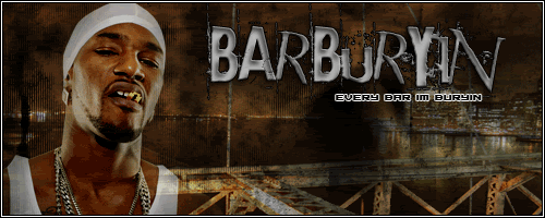
took about 20 mins blah so???feedback?
__________________
R.I.P SmokaJoka Joshua Christopher Sumner May 1, 1985 - October 8, 2004 "You Will Be Missed" |
||||||
 
|

|
|
10-03-04, 06:23 PM
|
|
||||||
|
Flyweight
|
IP: 252D 28ED
upp...for feedback you little shits LOOOOOOOOOOOOOOOOOOOOL
__________________
R.I.P SmokaJoka Joshua Christopher Sumner May 1, 1985 - October 8, 2004 "You Will Be Missed" |
||||||
|
|
|
|
10-03-04, 06:24 PM
|
|
|||||||
|
!$PHILLY TO DA FULLIEST$!

|
IP: FB7D C93A
its iight but need sum more color in there
__________________
|
|||||||
|
|
|
|
10-03-04, 06:36 PM
|
|
||||||
|
howdy

|
IP: 892E 81E1
im gonna totally tell you what you do to make it better...this isnt meant to sound harsh so dont take it the wrong way...
1)that grid is way too intense...if you are gonna do a grid do it in a color that looks good with the rest of the sig and do it about 20% opacity...you dont want the grid to be the focal point of your sig... 2)the subtext is too big and the main text isnt big enough...its like a power struggle for which one is gonna be the main text... 3)the main text is in a color that doesnt go well with the rest of the sig...if you suck at matching colors go to a paint site and copy and paste one of those paint cards into your sig and sample colors from it with the dropper...they all go together and it makes your sig look better...i did it that way until i got more of an eye for complimentary colors... 4)im not a big fan of more that one person in a sig...if you are gonna do it its better to break them up with the text between them and you have to make them match...go to blending options on both of them and do a color overlay of the same color at about 30% opacity...fiddle with it until they look like they match...this is also good for making a picture match your background...if i were you id sample the color for the overlay from your background... if you do all that you are on your way to elevating in sigs...this is good for a sig rookie but it just lacks some of the finesse that it needs...the elements clash with each other...at the risk of sounding like a hippie you want your sig to send out one vibe like a unified feeling of the whole sig...you have to do this with colors...people wont notice it when they see it but the sig will give them more of a feeling when they see it...i think it was the game that said "authors dont write books where chapter three doesnt have shit to do with chapter 12"... im not trying to sound hard on it...its a pretty good sig but it will be better once you fix those things...
__________________
 "Frank White the menacin, chron chron's the medicine.... I got the lettuce and... ...you turn green like cucumber skin Got the new hummer in the summer when I was a new comer then... drugs and mac-10's...hugs from fake friends..." Quote:
|
||||||
|
|
|
|
10-03-04, 06:38 PM
|
|
||||||
|
Flyweight
|
IP: 252D 28ED
 no problem we need harshness in the world no problem we need harshness in the world check AI tryout thread...bamboo style.... 
__________________
R.I.P SmokaJoka Joshua Christopher Sumner May 1, 1985 - October 8, 2004 "You Will Be Missed" |
||||||
|
|
|
|
10-03-04, 06:40 PM
|
|
||||||
|
howdy
|
IP: 892E 81E1
didnt i make you a sig before?
__________________
"Frank White the menacin, chron chron's the medicine.... I got the lettuce and... ...you turn green like cucumber skin Got the new hummer in the summer when I was a new comer then... drugs and mac-10's...hugs from fake friends..." Quote:
|
||||||
|
|
|
|
10-03-04, 06:41 PM
|
|
||||||
|
Flyweight
|
IP: 252D 28ED
yes...of course....dude
wait a sec i'll rock it
__________________
R.I.P SmokaJoka Joshua Christopher Sumner May 1, 1985 - October 8, 2004 "You Will Be Missed" |
||||||
|
|
|
|
10-03-04, 06:44 PM
|
|
||||||
|
howdy
|
IP: 892E 81E1
ha...i cant keep up with your name changes...you need a new one?
i like ashlanda better than this new name...it reminds me of a nun sneaking around with a gun shooting people...
__________________
"Frank White the menacin, chron chron's the medicine.... I got the lettuce and... ...you turn green like cucumber skin Got the new hummer in the summer when I was a new comer then... drugs and mac-10's...hugs from fake friends..." Quote:
|
||||||
|
|
|
|
10-03-04, 06:45 PM
|
|
||||||
|
Flyweight
|
IP: 252D 28ED
lmao...i know man....but dude....i like alias LOL
__________________
R.I.P SmokaJoka Joshua Christopher Sumner May 1, 1985 - October 8, 2004 "You Will Be Missed" |
||||||
|
|
|
|
10-03-04, 06:47 PM
|
|
||||||
|
howdy
|
IP: 892E 81E1
coming to theaters this fall
*cut to nun with pistol* *heartbeat sounds* voiceover: "she has witnessed corruption in the catholic church for years and shes ready to get even" *zoom in on a priests head through a window from outside* *black screen* *silenced gunshots* deadly habit...rated r...
__________________
"Frank White the menacin, chron chron's the medicine.... I got the lettuce and... ...you turn green like cucumber skin Got the new hummer in the summer when I was a new comer then... drugs and mac-10's...hugs from fake friends..." Quote:
|
||||||
|
|
|
|
10-03-04, 07:30 PM
|
|
||||||
|
Bonecrushing Nigga
|
IP: 3375 4717
Quote:
Word ummm i liked the first one better the second... nah...
__________________
Guess who?... ...Paramik Fuckin'...
...Owns You! ||RVS Text Champion||
|
||||||
|
|
|
 |
| Thread Tools | Search this Thread |
| Display Modes | |
|
|


 Linear Mode

