

|
|
|
|
| Phenom | Kingz | Dabatos | TonySelf | Tha Q | Half Breed | Tito | 7th End | RV Radio |
 02-21-06, 10:53 PM
|
|
||||
|
O.wning Y.ou D.aily

|
New Sig
IP: C166 AD4F
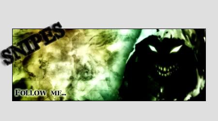
Just tried something different on this one. Lemme know what you guys think
 ™ ™
__________________
|
||||
  
|

|
|
02-21-06, 11:03 PM
|
|
|||||||
|
RV aint Dead
|
IP: 8091 27C7
dat shit is kinda dope
i say rock dat
__________________
|
|||||||
|
|
|
02-21-06, 11:03 PM
|
|
||||
|
Can u guess 2v's Gender?

|
IP: 6580 C051
liked it man.....
|
||||
|
|
|
02-22-06, 08:23 AM
|
|
|||||||
|
I'ma Royal
|
IP: 371E 6E4A
thats dope
looks clean good job ................. .................
__________________
:::::::::::::::::::::::::::::::::::::::::::::::::
::::::::::::::::::::::::::::::::::::::::::::::::: ::::::::::::::::::::::::::::::::::::::::::::::::: ::::::::::::::::::::::::::::::::::::::::::::::::: ::::::::::::::::::::::::::::::::::::::::::::::::: ::::::::::::::::::::::::::::::::::::::::::::::::: ::::::::::::::::::::::::::::::::::::::::::::::::: ::::::::::::::::::::::::::::::::::::::::::::::::: ::::::::::::::::::::::::::::::::::::::::::::::::: |
|||||||
|
|
|
02-22-06, 12:46 PM
|
|
||||
|
Middle Weight

|
IP: CDA8 A0B5
ROCK Your Newest Sig Like Ur Fucking A Girl!
__________________
R.I.P Proof  |
||||
|
|
|
|
02-23-06, 01:52 AM
|
|
|||||||
|
IP: A0C8 44A9
I like it mate.
|
|||||||
|
|
|
02-23-06, 02:35 AM
|
|
||||||
|
Seattle Hat Wit A Lean

|
IP: BA87 A0AC
Quote:
what in the hell but word sig is original its a lil bit bland, but not bad i say make the text stand out more, make it bigger and apply some nice effects not bad though
__________________
 --------------------------- Lucky Boy Beats: Owner & Producer http://www.myspace.com/luckyboybeats ---------------------------------------------- Gunn Play: Rv's Original Duo Dash Canceling To A Computer Near You MAS ON EM! 4 LIFE |
||||||
|
|
|
|
02-23-06, 05:19 PM
|
|
||||
|
O.wning Y.ou D.aily
|
IP: F8C9 295D
Thanks for all the feed on this. I didn't really try to make this look too detailed or anything. I just found a bunch of these drawings that were of different quality and tryed to make them match. I threw them all on a black and white background and threw my name in there......I thought of making my name bigger like Ltizzle suggested, but to me, I thought it covered too much of the picture. I tried to make my name stand out as much as I could without making it the center of attention and taking away from the actual picture.
But I'm still learning a whole lot, so all these tips are really helpful ™
__________________
|
||||
|
|
|
 |
| Thread Tools | Search this Thread |
| Display Modes | |
|
|


 Linear Mode

