

|
|
|
|
| Phenom | Kingz | Dabatos | TonySelf | Tha Q | Half Breed | Tito | 7th End | RV Radio |
|
|||||||
| View Poll Results: Who won this battle? | |||
| Chief |
|
5 | 100.00% |
| Youngandreckless |
|
0 | 0% |
| Voters: 5. You may not vote on this poll | |||
|
|
Thread Tools | Search this Thread | Display Modes |
 10-08-05, 11:30 AM
|
|
|
Light Weight

|
Youngandreckless vs Chief
IP: 0E0E C63B
Battle Rules:
6 - UNLIMITED Lines No Crew Votes No Recycling No Biting Topic:Rap Cd Advertisement Size:500 by 400 Minimum posts to vote: 100 Check in by: 10-11-05 at 11:30 AM Must drop verse in 4320 minutes after check in. |
|
|
|
10-08-05, 11:31 AM
|
|
|
|
Guest
|
IP: 0E0E C63B
Youngandreckless has ACCEPTED this battle on 10-08-05 11:31 AM.
|
|
|
|
|
10-08-05, 02:14 PM
|
|
|
Light Weight
|
IP: 0E0E C63B
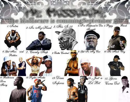 I only put 15 tracks so i could meet the 500 by 400 size
__________________
|
|
|
|
10-08-05, 02:23 PM
|
|
|
Light Weight
|
IP: 0E0E C63B
uppin your shit chief
you got like 3 days or something to post
__________________
|
|
|
|
10-09-05, 04:37 PM
|
|
|
|
Guest
|
IP: 41DD 8C44
Chief has ACCEPTED this battle on 10-09-05 04:37 PM.
|
|
|
|
|
10-09-05, 05:41 PM
|
|
|
Light Weight
|
IP: 0E0E C63B
u didn't make any of those logos thats a font from dafont.com vote up tho
__________________
|
|
|
|
10-09-05, 05:55 PM
|
|
|
Middle Weight
|
IP: C83A 8EB7
Voted For: Chief
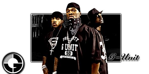
chief- really feelin the jadakiss text, but not the other text if the subtext was better, this wud be a very believable real promo poster. i dont like how the album cover was put on there either, if i was makin this i wudnt hav included it, but u shudve at least put a border on it. imo, it wudve been better witout the album cover, n wit the ruff ryders text bein changed to "kiss of death." overall good job tho, 8.5/10 youngandreckless- i like the concept, but i dont like the way u did it. i kno that u had to make it the right size, but u shudve made everythin fit, otherwise it isnt at all believable (no1 wud advertise 3/4 of a cd only) it also means that u got to a certain point, found out that everythin wudnt fit, and were 2 lazy 2 go back n fix it. u had 3 days to drop this, so u shudve just gone back and taken the extra time to make it look better. the only other thing that i wasnt feelin was the pics. wit the exception of a few, they really didnt fit in wit the song they were advertisin. there also cud've been better borders between the song frames not bad tho, 6.5/10 vote-chief please rtf to the link in my sig thx  |
|
|
|
10-09-05, 05:58 PM
|
|
|
|
RV aint Dead
|
IP: 27DE BD9F
Voted For: Chief
Chief win no need fo explanation......................... just dope
__________________
|
|
|
|
|
10-09-05, 07:56 PM
|
|
|
|
.:Certified Mystique:.
|
This was feedback posted for Youngandreckless
IP: 3475 61F6
i like this 1 cuz it has more but tha other 1 has more color and more graphix in it...im not gon vote though..nice job
|
|

|
|
|
10-09-05, 08:28 PM
|
|
|
HAHAHAHAH!..i onno

|
IP: 1D2D 3134
Voted For: Chief
even tho i didnt liek it that much, it was better than..Youngandreckless's Rap Cd Advertisement.. good rapper than the trash 50 Cent and better feel to it..
__________________
GFX Record 52-8-39KO  |
|
|
|
|
10-10-05, 01:44 PM
|
|
|
Bann The Deed NOT The Breed

|
IP: C5F9 47E5
Voted For: Chief
chief loving the text that says jadakiss love the bwckground and you said u made all of the logos so props luvthe pepsi one like the ruff rydesr text 2 but im not feeling the pic choice in the bottom corner yr i like the little bit of bg there is the text is nice but hard to read cause its soo light not felling the single pic wiht no backgroud some of those pics didnt even fit the tracks in my opinion but not bad
__________________
  O.Y.D. |
|
|
|
10-11-05, 05:14 PM
|
|
|
|
..Rv Sucks..

|
IP: CE10 8C0C
Voted For: Chief
ima giving htis to sheif young-aiight you had an okay cover i liked the banner but the txt on the banner was hard to read and it wasnt good txt at all....i do like your idea and creativity for the cover tho......pretty good but not enough it was kinda plain and basic coulda dont more to it 5/10 sheif-aiigth your cover was better because one you had better txt choice...you could read the txt better but i didnt like how the s in ruff ryders seemed cut off...if it was dont purposely then why not just have erased the s also i felt the jada pic coulda been blended into the sig more....so it would be harder to tell it was just an actual album cover pic thrown in there......i liked the bg tho it was interesting......i think you grasped the whole advertisement thing wrong it wasnt bout other advertisements it was bout advertising a cd...but i felt you got this because of you put more effort and time into your sig...also you coulda made the pic of jada on the right a lil more noticeable but it was aiight 6.5/10 rtf honestly......links in sig.....if vote not returned by fri at most this vote will be deleted
__________________
|
|

|
|
| Thread Tools | Search this Thread |
| Display Modes | |
|
|


 Linear Mode

