

|
|
|
|
| Phenom | Kingz | Dabatos | TonySelf | Tha Q | Half Breed | Tito | 7th End | RV Radio |
 07-13-08, 06:12 PM
|
|
||||||
|
.................

|
CD cover for upcoming project
IP: 4C6B C700
Here is a preview of my cd cover for my scheduled drop of Aug 5th
__________________
  Bringing back the oldschool hiphop Last edited by BigTony.Self : 07-13-08 at 06:16 PM. |
||||||

|
|
07-13-08, 06:21 PM
|
|
||||||||
|
Pushin it....

|
IP: F3E4 5E69
lol, dude...thats pretty dope
__________________
Quote:
  Destroyin Tricks on the Daily   |
||||||||
|
|
|
07-13-08, 08:38 PM
|
|
|||||||
|
IP: 878F A0FB
It feels like its missing something. Honestly if i saw it on a shelf I wouldn't pick it up. Its to basic. Image is everything you could be the dopest rapper alive but most people will pass it up in a line up.
__________________
THE TRUTH IS I'M BETTER THAN YOU |
|||||||

|
|
|
07-13-08, 08:47 PM
|
|
||||||
|
.................
|
IP: 4C6B C700
to each there own preference thx for stopping by
__________________
Bringing back the oldschool hiphop |
||||||
|
|
|
07-13-08, 09:36 PM
|
|
||||||
|
Whys That?
|
IP: 967B 85BD
Because its simple, yet proffesional, I would pick it up.
Luck with this. |
||||||
|
|
|
07-13-08, 09:38 PM
|
|
||||||
|
.................
|
IP: 4C6B C700
i will say i have it in both black backround white letters and the one you see i chose this cuz its cost effective as far as printing and ink goes.....
__________________
Bringing back the oldschool hiphop |
||||||
|
|
|
07-13-08, 10:57 PM
|
|
||||||
|
Whys That?
|
IP: 967B 85BD
Proffesional printing companys also need a 'bleed area'. White BG usually works the easiest.
|
||||||
|
|
|
07-14-08, 09:06 AM
|
|
|||||
|
~SAINT SINNER~

|
IP: 611A A12A
not bad at all.
 good shit. good shit.i might have thrown the italian colors up behind the mobster (or in his tie) though...to balance it out nicely, but that's just me. good luck self. can't wait to hear it my man (no homo). oner. s.v.
__________________
Quote:
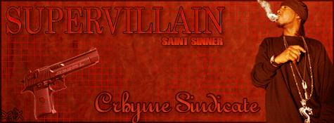 QUESTION: Is it even possible to improve upon perfection??? ANSWER: CRHYME SINDICATE  "I remember this one time I thought I was wrong........but I was mistaken." -Unknown R.I.P. Jonathan "ONE MAN BAND/TERUMOTO" Nigro. Goodbye brother. God bless the dead. One love. |
|||||
|
|
|
07-14-08, 02:38 PM
|
|
|||
|
WhoAreYou?
|
IP: A181 D033
i like it
did you draw the pic yourself, get it custom made or what cos its pretty cool for real |
|||
|
|
|
07-15-08, 05:29 PM
|
|
|||||||
|
10:23 till i'm 86

|
IP: E47F 2F43
its dope, but wheres dudes torso? and i think the italian flag's colors on the tie would be cool, if he had a whole tie
__________________
Big Pic- Whore of the World ( youtube video)  Jesus saves, even from paranoia myspace.com/marktimothyschafer my reverbnation.com page |
|||||||

|
|
|
07-15-08, 10:06 PM
|
|
||||||
|
Addicted

|
IP: 24E0 3C56
that shit looks sick
__________________
...THE BADASSES ARE BACK...
_C.RHYME S.INDICATE_ "RAPVERSE'S ORIGINAL LEGACY OF EXCELLENCE"  |
||||||
|
|
|
07-17-08, 11:01 PM
|
|
||||
|
Jack The Ripper

|
IP: BC6E A205
the italian flag on it is the worse part, it sucks huge dick, you should take that off then it'd be aight
|
||||
|
|
|
07-18-08, 11:12 AM
|
|
|||||||
|
inFAMOUS

|
IP: 55BC 579E
not really feelin the cover
somethin about the tonyself text seems out of place not really blended in the flag thing jus aint workin PA sticker looks like it was put anywhere where there was space... really it jus looks like someone drew the dude.. scanned it n jus put everything in from MS Paint other then that the drawing is great..shuda drew out the whole chest area.. n that idea about the tie thing having the flag colors would be dope |
|||||||
|
|
|
07-18-08, 04:21 PM
|
|
||||||
|
.................
|
IP: 4C6B C700
ill stick with the majority opinion thx for looking guys
__________________
Bringing back the oldschool hiphop |
||||||
|
|
|
07-18-08, 05:30 PM
|
|
||||
|
Jack The Ripper
|
IP: F540 07B2
all im saying is wops suck, so that flag... sucks
it'd look cool without it tho |
||||
|
|
 |
| Thread Tools | Search this Thread |
| Display Modes | |
|
|


 Linear Mode

