

|
|
|
|
| Phenom | Kingz | Dabatos | TonySelf | Tha Q | Half Breed | Tito | 7th End | RV Radio |
 09-21-05, 08:44 PM
|
|
||||
|
Light Weight
|
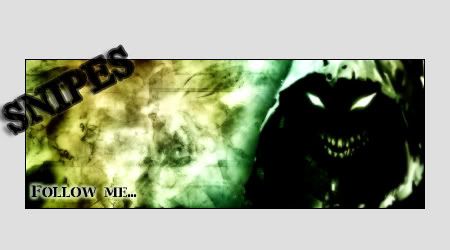
Remake of my sig
IP: C056 C9C7
 left the bg alone, just took off the dark strip, changed the font around, made it smaller, etc. and before you say the pixel stretch is played, i kno that, but still i like how it comes out 
__________________
  |
||||
   
|

|
|
09-21-05, 08:53 PM
|
|
||||||
|
hullabaloser

|
IP: ECB3 36A0
I still like the text over text idea. you pulled it off.
but the pixel font is just terrible. It's far too thick and ugly for a sig like that. Try something like Visitor
__________________
.The Council |
||||||
|
|
|
|
09-21-05, 09:11 PM
|
|
||||||
|
HAHAHAHAH!..i onno

|
IP: 1D2D 3134
its good,..keep ya shit up.......
__________________
GFX Record 52-8-39KO  |
||||||
|
|
|
|
09-21-05, 10:31 PM
|
|
|||
|
Do Re Mi
|
IP: CE81 12D4
you got some color going across his face and its buggin me lol
but pretty nice.. play with the text in the back its not quite right
__________________
crhyme sindicate . . . . . |
|||
|
|
|
09-23-05, 05:02 PM
|
|
||||
|
GG Haterz

|
IP: 71E7 6664
Put the scriptina font underneath the name, and maybe make the opacity 90?
__________________
 Quote:
For Anyone Who Wants to Talk to Me  ^^I think this explains my view on gangster rap perfectly. |
||||
|
|
|
09-23-05, 06:29 PM
|
|
|||||
|
Seattle Hat Wit A Lean

|
IP: BA87 A0AC
love the colors, hate the text.
text just looks sloppy the double text thing is hard to pull off, so i dont blame ya for not doing it. i do love those colors though.
__________________
 --------------------------- Lucky Boy Beats: Owner & Producer http://www.myspace.com/luckyboybeats ---------------------------------------------- Gunn Play: Rv's Original Duo Dash Canceling To A Computer Near You MAS ON EM! 4 LIFE |
|||||
|
|
|
|
09-23-05, 10:51 PM
|
|
|||||||
|
RV aint Dead
|
IP: 89F4 8F9F
wat da difference
__________________
|
|||||||
|
|
|
09-24-05, 09:25 AM
|
|
||||
|
Middle Weight
|
IP: 678E FBEE
even doper than the 1st 1
|
||||
|
|
 |
| Thread Tools | Search this Thread |
| Display Modes | |
|
|


 Linear Mode

