

|
|
|
|
| Phenom | Kingz | Dabatos | TonySelf | Tha Q | Half Breed | Tito | 7th End | RV Radio |
|
|
 02-07-06, 07:00 PM
|
|
|
|
Light Weight

|
logo
IP:
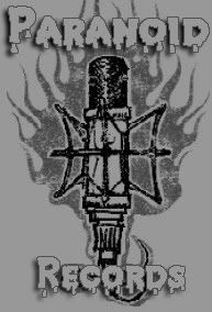
i created a quick logo for myself
wut y'all think .. N maybe i should get rid of the text dunno 
__________________
  ya do real shit , ya get real results ya do real shit , ya get real resultsya do fake shit , ya get fake results  |
|

|
|
02-07-06, 07:09 PM
|
|
||
|
GG Haterz

|
IP:
Lower the bevel and emboss.
__________________
 Quote:
For Anyone Who Wants to Talk to Me  ^^I think this explains my view on gangster rap perfectly. |
||
|
|
|
09-27-06, 11:31 AM
|
|
||
|
New to RV

|
IP:
thats alright that .....i agree wiv sane
|
||

|
|
|
10-04-06, 06:28 PM
|
|
||
|
inFAMOUS

|
IP:
take that bevel shit off. the text is ass. u could prolly use a more professional font overall not feelin it. keep tryin |
||
|
|
|
10-04-06, 06:40 PM
|
|
|||
|
GG Haterz
|
IP:
Quote:
You seriously need to stop doing this.
__________________
Quote:
For Anyone Who Wants to Talk to Me ^^I think this explains my view on gangster rap perfectly. |
|||
|
|
|
10-06-06, 03:37 PM
|
|
|||
|
The Paragraph President

|
IP:
Quote:
he's ridin ya dick dude. lol anyway, the logo is pretty cool, don't look like it symbolizes much though. but it's w/e I dont know bout that bevel shit or w/e it's called but it looks decent. doesn't really have any meaning for a artist logo though. maybe for a gfx logo.
__________________
|
|||

|
|
|
10-05-06, 10:59 PM
|
|
||
|
O.wning Y.ou D.aily

|
IP:
I actually like it. I'd dullen up the stroke around the text a little and maybe choose a slightly different one, but overall, I like it

__________________
|
||

|
|
|
10-06-06, 03:40 PM
|
|
||
|
Is Betta Than You

|
IP:
that r the 2 blue things in the middle?
__________________
 |
||
|
|
|
 |
| Thread Tools | Search this Thread |
| Display Modes | |
|
|


 Hybrid Mode
