

|
|
|
|
| Phenom | Kingz | Dabatos | TonySelf | Tha Q | Half Breed | Tito | 7th End | RV Radio |
 01-05-05, 01:25 AM
|
|
||
|
Bangs like bikini attol

|
Ladalalasdsdvopsmvsdvins
IP:
New sig..
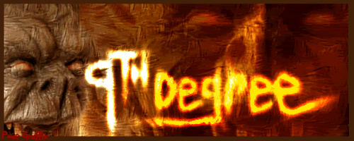 Just thought I'd get peoples opinions.. And just so some smart ass 13 year old faggot graphics head doesent come in and say err thats too simple.. Heres what I did.. I got the image from a website I forget which one.. Some vampire type shit.. Mirrored it so I could put the head on the other side of the image.. Then I used a dodge tool and drew up the letters so they were different and it didnt look played with all the e's being the same in the pic, added a texture setting with a bump map, adjusted the contrast with the burning tool and then I went over the letters again to brighten them up and then finally I used some saturation filters to finish it up and brighten the background with a red tint cause it was getting harder to see.. (Then ofcoarse I put the little border around) Last edited by Nostradamus : 01-05-05 at 01:33 AM. |
||

|

|
| Thread Tools | Search this Thread |
| Display Modes | |
|
|


 Threaded Mode