

|
|
|
|
| Phenom | Kingz | Dabatos | TonySelf | Tha Q | Half Breed | Tito | 7th End | RV Radio |
 05-29-06, 07:19 PM
|
|
||||
|
O.wning Y.ou D.aily

|
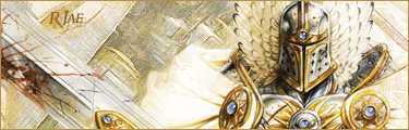
My best design yet....
IP: B8A5 A8A7
I've been wanting to make a new front page design for my website, but never really knew what to make until I started talking to SPuL......he kinda guided me the military route.....lol
 I edited it a little.....
__________________
Last edited by Enygma : 05-29-06 at 09:26 PM. |
||||
  
|

|
|
05-29-06, 07:24 PM
|
|
|||||
|
Flyweight

|
IP: A908 0188
its nice... just not feelin it tho....
good work tho.. lol
__________________
 [..'Raw Intellect From A-Z'..] ... [A-kademik-Z]  |
|||||
|
|
|
05-31-06, 07:20 AM
|
|
||||
|
New to RV

|
IP: CDA8 A0B5
i like it enygma.....good use of colors but its kinda messy as el rey said....
but keep it up...
__________________
 |
||||
|
|
|
|
05-31-06, 10:52 AM
|
|
|||||||
|
inFAMOUS

|
IP: 5043 32F4
shits too colorful.. like u got brown,red,blue,white,black,dark red, dark blue,lots of colors.. u shud blend the thing in more...like maybe to 2 colors...,.then it would look ok. |
|||||||
|
|
|
05-31-06, 05:07 PM
|
|
|||||
|
Is Betta Than You

|
IP: 0594 3125
shyts dope, personally i think it would be even better if you had a picture of you on there, like spuls
|
|||||
|
|
|
|
05-31-06, 06:06 PM
|
|
||||
|
I don't lose
|
IP: A68E 9D69
ill concept, but for some reason the colors throw me off...i unno, better than my shit i know that much
__________________
 well i thought about the army
dad said, son you're fucking high and i thought, yeah there's a first for everything so i took my old man's advice three sad semesters it was only fifteen grand spent in bed i thought about the army i dropped out and joined a band instead  |
||||
|
|
|
05-31-06, 09:11 PM
|
|
||||
|
GG Haterz

|
IP: A9F0 3D57
If you make the text brown colored like the tank, it will look much better.
__________________
 Quote:
For Anyone Who Wants to Talk to Me  ^^I think this explains my view on gangster rap perfectly. |
||||
|
|
|
05-31-06, 11:49 PM
|
|
||||
|
On The Air - COMIN JAN 07

|
IP: BACC 8E92
THis is pretty straight.....I think that instead of filling the enygma with the america flag you should maybe try and fill it with the sand como that'd be reallly tight and blend better and take out the thing in the back cuz it dont really fit
but overall its pretty straight |
||||
|
|
|
06-01-06, 11:53 AM
|
|
||||
|
NOK

|
IP: C3ED 7F10
werd if a pic of you was in there with less colors and blended more this would be dope.
__________________
 Original N.O.K Member
  |
||||
|
|
|
 |
| Thread Tools | Search this Thread |
| Display Modes | |
|
|


 Linear Mode

