

|
|
|
|
| Phenom | Kingz | Dabatos | TonySelf | Tha Q | Half Breed | Tito | 7th End | RV Radio |
 10-18-04, 01:07 PM
|
|
||||

|
newest automatik sig
IP: 23CC 11AC
eh ... peep it ladies ....
|
||||

|
|
10-18-04, 01:08 PM
|
|
||||
|
IP: 23CC 11AC
word ... it'll help if i posted it
|
||||
|
|
|
10-18-04, 01:11 PM
|
|
||||
|
yawn
|
IP: 9FA2 8485
pretty nice., clean and simple.
__________________
do your research. 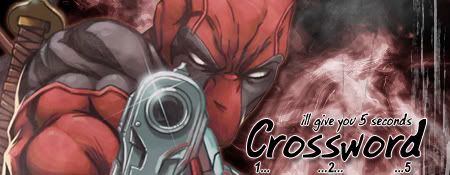 |
||||
 
|
|
|
10-18-04, 01:50 PM
|
|
|||
|
illy fo' really
|
IP: A10D 4933
Woah!
 Dopeness, all i can say. Dopeness, all i can say.It'd be even more dope if ya did me one for FREE!..lol |
|||
|
|
|
10-18-04, 01:51 PM
|
|
||||
|
IP: 23CC 11AC
ahhh .... probably not ...
|
||||
|
|
|
10-18-04, 01:53 PM
|
|
||||
|
illy fo' really
|
IP: 9588 E886
Quote:
lol... ah well, worth a try. |
||||
|
|
|
10-18-04, 02:38 PM
|
|
||||
|
..."6s"...
|
IP: 7953 1A91
defintely elevating, keep up the good work (nice colors too)
__________________
::[ - THE PROBLEM WITH THIS GENERATION - ]:: |
||||

|
|
|
10-18-04, 04:10 PM
|
|
|||||||
|
Philadelphia Shelfin' Ya

|
IP: D4CC BCDF
wack.......the bar is WAY out of place, and its covering his face
fix that by moving the layer his face is on, above the layer that the bar is on, and it might be decent also, the stroke around him sucks.........and the font in the white bar is mispositioned, and you should add a 1px border, and lower the opacity a tad or sumthin to blend him with the darker red in the bground beter
__________________
|
|||||||
|
|
|
|
10-18-04, 04:21 PM
|
|
||||
|
IP: 23CC 11AC
^ thats what im lookin for.
thanks i'll see if i can do that.. |
||||
|
|
|
10-18-04, 04:27 PM
|
|
||||
|
IP: 23CC 11AC
aiight how this. ...
|
||||
|
|
|
10-18-04, 04:32 PM
|
|
|||||
|
Ill Emcee

|
IP: C665 8FBD
It is awsome...i like the bar across the middle ... thast is awsome...
I like the white letters and the red back ground... those colors go to getha....... and how the background is all scratchy Ilike that.. The picture is a good one.... I am liking it.. keep it up ... Peace~~~~~....
__________________
 GoDz AnGeL GoDz AnGeL Ill Emcee
|
|||||
|
|
|
|
10-18-04, 04:34 PM
|
|
||||
|
IP: 23CC 11AC
yeh .... thanks
|
||||
|
|
|
10-18-04, 04:35 PM
|
|
||||
|
IP: 23CC 11AC
some kat PM'd me and requested this color. so rate this one ...
|
||||
|
|
|
10-18-04, 04:36 PM
|
|
|||
|
1926

|
IP: 0825 899A
I Like How All Your Images Look Cristal Clear...
Like Mine Look Clear, But Not Like Yours... I Dunno, Something About Yours Are Very Apealing Even Though So Simplistic... .One. |
|||
|
|
|
10-18-04, 04:36 PM
|
|
|||||||
|
Philadelphia Shelfin' Ya
|
IP: D4CC BCDF
^^^ obviously doesnt know graphics........lol
this is an amatuer sig, but i dont expect him to be making much more than this honestly this was all i was making for a while but you improved upon it by doing what i said.......nice flip on the text too and you also lowered the opactiy on the bar, which ifailed to point out, was too bright big ups on that but he still could blend with the bground bettter.......other than that merely flawless and add a black1px storke............its more visible, makes it look cleaner and also, feel free to add a nice texture, li ke a tight packed grid, or real thin scanlines......it makes them appear cleaner as well anywho, nice sig now, just fix your avy and your good
__________________
|
|||||||
|
|
|
 |
| Thread Tools | Search this Thread |
| Display Modes | |
|
|


 Linear Mode

