

|
|
|
|
| Phenom | Kingz | Dabatos | TonySelf | Tha Q | Half Breed | Tito | 7th End | RV Radio |
|
|
 07-04-06, 11:58 AM
|
|
||
|
Nt Your Average

|
Some Work...
IP:
 Made For JD^^ 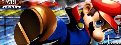 Marioo!!!   Left feed on revs speats sig
__________________
OYD MAFIA
|
||
 
|

|
|
07-04-06, 01:27 PM
|
|
|
|
Hell yeah

|
IP:
man i really love that mario sig, put my name on it
 |
|
|
|
|
|
07-04-06, 02:18 PM
|
|
||
|
™

|
IP:
Breed, did you make that one in your sig?
if so, its much better than any of these... 
__________________
"Motherfuck a struggle, lets dance in the rain"
★ G ☆ U ★ N ☆ N ★ E ☆ R ★  |
||
|
|
|
07-04-06, 02:33 PM
|
|
||
|
Nt Your Average
|
IP:
LOL....yeah.....
__________________
OYD MAFIA
|
||
|
|
|
|
07-04-06, 04:46 PM
|
|
|

|
IP:
Damn those are some hot sigs, you think you can hook a homie up?
__________________
The Competition
 |
|
|
|
|
|
07-04-06, 06:02 PM
|
|
||
|
Nt Your Average
|
IP:
Uhh "left feed on revs speats sig"
-_-
__________________
OYD MAFIA
|
||
|
|
|
|
07-05-06, 04:21 AM
|
|
||
|
Nt Your Average
|
IP:
aight sorry....

__________________
OYD MAFIA
|
||
|
|
|
|
07-05-06, 02:09 PM
|
|
||
|
New to RV
|
IP:
yo Half breed...love the work. that mario one looks dope and ur sig is hot. if u makin sigs for ppl, get at me...i love the work
__________________
www.soundclick.com/7curse "Its not poker, but ill break ya ass wit one hand "  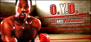 |
||
|
|
|
|
07-05-06, 10:25 PM
|
|
||
|
Better THAN You!
|
IP:
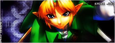
i like the contrastin colors int he Zelda most..man i've been having Writer's Block with Graphics lately...can't seem to think of anything new..lmao...but i love these man..good job
__________________
iGhostwrite Mixtape DL |
||
|
|
|
|
07-06-06, 12:05 AM
|
|
||
|
IP:
the M on the mario one dont look beveled the same as the rest, and the rest looks to close to the m which makes it looks like 2 different text layers, but idk
The other ones I like
__________________
 DOPER THEN DOPE |
||
|
|
|
|
07-10-06, 12:43 PM
|
|
||
|
GG Haterz

|
IP:
Guess you discovered pixel stretch, lol.
Aight, these are pretty decent, and you've elevated amazingly. Now, you need to use a black border in the end, cuz it just looks better and the white on these skins usually don't show. Make sure the text doesn't go on the border, and make that pixel font smaller that's in the top right corner. Get out of the habit of always using pixel font, gotta keep ya creativity up. You need to start working on blending too cuz as it is it looks like you just put it there.
__________________
 Quote:
For Anyone Who Wants to Talk to Me  ^^I think this explains my view on gangster rap perfectly. |
||
|
|
 |
| Thread Tools | Search this Thread |
| Display Modes | |
|
|


 Hybrid Mode
