

|
|
|
|
| Phenom | Kingz | Dabatos | TonySelf | Tha Q | Half Breed | Tito | 7th End | RV Radio |
 10-10-05, 03:35 PM
|
|
|||||

|
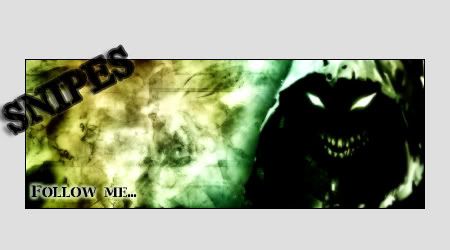
First Sig I made for Someone..
IP: D792 1390
Paranoid wanted blue "wintery-look" + Nas.. and a certain type of font.. and this what I came up with..
 and that's my first attempt at a hangover as well.. plz lemme know tips and such, i dunno what I did to this sig in terms of Photoshop, i just messed with a whole bunch of stuff.
__________________
|
|||||
  
|

|
|
10-10-05, 05:38 PM
|
|
|||||||
|
You Cant Handle The Truth

|
IP: 13CA 03C0
as I told you on AIM, the white background, not feelin' it...you should just let his head and the lettering stay outside the SIGy itself, would've been more interesting that way...the background FUCKs up the feel of it =\...FIX IT!! lol
__________________
 ^ WE - RAWWCAST - 24/7 ^ Quote:
Quote:
|
|||||||
|
|
|
|
10-10-05, 05:39 PM
|
|
|||||
|
IP: D792 1390
Use a different skin to view it... the red/blue original skin... ~_~ goodness woman, and it's not WHITE it's grey.. to match the red/blue skin
__________________
|
|||||
|
|
|
|
10-10-05, 06:56 PM
|
|
|||||||
|
RV aint Dead
|
IP: 56B7 8D2E
its nice god colors
__________________
|
|||||||
|
|
|
10-10-05, 08:12 PM
|
|
|||||
|
Seattle Hat Wit A Lean

|
IP: BA87 A0AC
hmm
well first off i do like the colors the mixture of blue and white really did give it that "icy blue" para was looking for. however... the white text looks good up until it goes off the sig. the white on grey just doesnt work, especially with the glow...it really makes the text hard to read. im not liking the giant feather on the box either if youre trying to make the sig a different shape, go into the shape choices and theres one that looks exactly like you want...more of an ovalish box...pick that and form your shape through that. thatll make the overhang easier as well, considering the bottom of the picture wont be visible. overall its ok i know youre still a beginer (plus yous mah girl  ), so im not gon take it hard on you because when i was begining i had problems with the same things... ), so im not gon take it hard on you because when i was begining i had problems with the same things...fix up a few things here and there, and itll look dramatically better.
__________________
 --------------------------- Lucky Boy Beats: Owner & Producer http://www.myspace.com/luckyboybeats ---------------------------------------------- Gunn Play: Rv's Original Duo Dash Canceling To A Computer Near You MAS ON EM! 4 LIFE |
|||||
|
|
|
|
10-10-05, 08:16 PM
|
|
||||
|
Middle Weight
|
IP: C83A 8EB7
i think its dope except 4 the pic
the pic's hard edges really dont fit wit the soft edges of the rest of the sig u shudve blurred or feathered the edges to make it fit in better real good 4 a beginner tho  |
||||
|
|
|
10-10-05, 08:31 PM
|
|
|||||
|
IP: D792 1390
aight I dunno what y'all mean by feathered, i really dunno the terms of photoshop lol.. but thanx fa the feed, i'll figure out how to make it better thru y'all help.. oh yeah, marry me tizzle!
OOO i know what y'all mean bout the pic's edge... the bottom part of his t-shirt shoulda be blended in better wit the shape of the sig, i understand that. but still don't know how to do it. lol I'mma figure it out, teachers. Thanx 
__________________
|
|||||
|
|
|
|
10-10-05, 08:35 PM
|
|
|||||
|
Seattle Hat Wit A Lean
|
IP: BA87 A0AC
^^word to us being married now.
no problem hun
__________________
--------------------------- Lucky Boy Beats: Owner & Producer http://www.myspace.com/luckyboybeats ---------------------------------------------- Gunn Play: Rv's Original Duo Dash Canceling To A Computer Near You MAS ON EM! 4 LIFE |
|||||
|
|
|
|
10-10-05, 09:11 PM
|
|
||||||
|
HAHAHAHAH!..i onno

|
IP: 1D2D 3134
everything is nice until the text goes off the Bg, and the Nas pic is sharp on the edges..bottom of him..should have faded him..and added a shadow on him..
__________________
GFX Record 52-8-39KO  |
||||||
|
|
|
|
10-11-05, 04:33 PM
|
|
|||
|
Do Re Mi
|
IP: EFE2 69C5
pretty good for your first.. could use some work tho but its nice
__________________
crhyme sindicate . . . . . |
|||
|
|
 |
| Thread Tools | Search this Thread |
| Display Modes | |
|
|


 Linear Mode

