

|
|
|
|
| Phenom | Kingz | Dabatos | TonySelf | Tha Q | Half Breed | Tito | 7th End | RV Radio |
 02-05-06, 12:31 AM
|
|
|||||||
|
Flyweight

|
IP: 405E C2C5
yes i humor everyone lol
__________________
This What Happens When Photoshop is Mis-Used
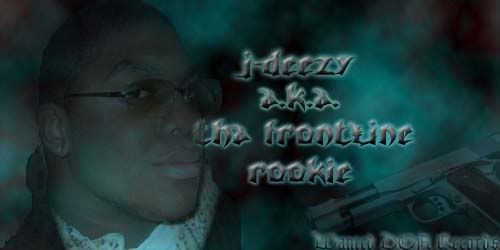 Split Level: the guns pointing towards him its a subliminal message its like im gay so shoot me |
|||||||

|
|
02-05-06, 04:40 AM
|
|
|||||
|
The Paragraph President

|
IP: 2372 BC06
never seen anything like that before, dopeness.
__________________
|
|||||
 
|
|
|
02-05-06, 11:53 AM
|
|
||||
|
Middle Weight
|
IP: F03F EB52
fucka hater, this is easily the best photo manip i've seen
perfectly pieced together, just amazin man n stfu hass, u'll never be able to make somethin that good the last sig u've made looks like this 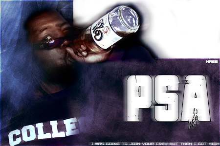 stay up g, that shit is FIYA |
||||
|
|
|
02-05-06, 12:19 PM
|
|
||||||
|
New to RV
|
IP: EFF3 0899
feelin it man, i think its pretty damn good...keep at it
|
||||||
|
|
|
02-05-06, 01:11 PM
|
|
|||||||
|
Artist, that simple

|
IP: 317F 66B6
thanks for the feed peeps, uppin...........
__________________
Grim |
|||||||
|
|
|
|
02-06-06, 12:10 AM
|
|
|||||
|
New to RV

|
IP: 5314 D272
It's alright. Would have come together a LOT more better if it was less monochromatic, aside from the little color you see through the door. I feel you used way too many dark areas and it makes it seem like you're hiding areas as if the job couldn't be pulled off well.
The first part of the piece my eye notices flaw is where the curb and street meet. It's too unrealistic. and flat. No depth at all. Other than that, it's a pretty decent manipulation. There are some decent heads on this site, who do work other than sigs and I like that. |
|||||
|
|
|
02-06-06, 01:31 AM
|
|
|||||
|
in your system
|
IP: 9E2F CDE8
yeah man, its cool to look at...the sky turned out awesome
__________________
this world is a drug, and everyone's selfish FLY FREE |
|||||
|
|
|
|
02-08-06, 12:35 PM
|
|
||||||
|
Light Weight
|
IP: 9014 DBA9
I like the concept... But I think the black areas look kind of purposeful like you used them to cover up edges when blending instead of looking like natural shadows. And it would have been alot stronger if the path/door was more emphasized.
It feels like the stock photos were more in control of what the result was.
__________________
Dead |
||||||
|
|
 |
| Thread Tools | Search this Thread |
| Display Modes | |
|
|


 Linear Mode

