

|
|
|
|
| Phenom | Kingz | Dabatos | TonySelf | Tha Q | Half Breed | Tito | 7th End | RV Radio |
 11-14-05, 08:36 PM
|
|
||||
|
GG Haterz

|
First In a Bit
IP: 4C4D 7EA1

__________________
 Quote:
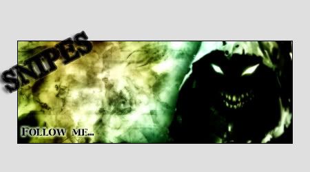
For Anyone Who Wants to Talk to Me  ^^I think this explains my view on gangster rap perfectly. |
||||

|
|
11-14-05, 08:38 PM
|
|
||||

|
IP: 31C2 62EB
Woah thats pretty tight im not really feeling that color but its pretty cool..decent text...bgs pretty cool..track blending in with the globe..overall pretty cool job.
__________________
The Competition
 |
||||
 
|
|
|
11-14-05, 09:04 PM
|
|
|||||||
|
RV aint Dead
|
IP: 229C 1F30
dope
i will finish 1st
__________________
|
|||||||
|
|
|
11-14-05, 09:44 PM
|
|
|||||
|
Maggot
|
IP: F11D 501C
jea dats dope but im not feelin da color
__________________
A.I.
Dont Battle Us..Cuz You Will Lose .
. |
|||||
|
|
|
|
11-15-05, 06:27 PM
|
|
|||||
|
Seattle Hat Wit A Lean

|
IP: BA87 A0AC
ehh its ok
the red on kanye looks wayy too intense, id tone down the contrast, itll make it easier on the eyes. speaking of kanye, he looks pretty damn big id resize him down just a tad, i think hes TOO big for the sig text could be a bit more original, its kinda jus there. make it fill more space up vertically, do w/e you need to do that. overall its decent for a comeback sort of sig, theres still a few things you need to fix though.
__________________
 --------------------------- Lucky Boy Beats: Owner & Producer http://www.myspace.com/luckyboybeats ---------------------------------------------- Gunn Play: Rv's Original Duo Dash Canceling To A Computer Near You MAS ON EM! 4 LIFE |
|||||
|
|
|
 |
| Thread Tools | Search this Thread |
| Display Modes | |
|
|


 Linear Mode

